Fros Bold: A Display Font That Commands Attention Online
As a UI designer who ships landing pages, SaaS dashboards, and brand-forward e-commerce experiences, I don’t reach for display fonts lightly. They’re not background players—they’re tone-setters, hierarchy anchors, and first-impression accelerators. Fros Bold is one of the few display fonts I’ve added to my go-to kit because it delivers personality without sacrificing digital legibility or layout control.
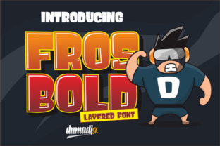
Visually, Fros Bold balances bold geometry with playful imperfection. Its uppercase-heavy structure features subtle irregularities—slightly uneven stroke endings, asymmetric counters, and confident, compact letterforms. It’s not cartoonish, nor is it sterile. Think “confident mascot meets modern branding”—ideal for game studios naming a new title, indie creators launching a podcast, or boutique brands naming their signature product line. The weight is dense but open enough to breathe on screen, and the x-height is generous, supporting readability even at smaller display sizes.
In real web layouts, Fros Bold excels where impact matters most: hero section headlines, event banners, course title cards, and shop category headers. I recently used it for a creative coaching site’s main headline—“Unblock Your Voice”—overlaid on a soft gradient background. Paired with a clean, neutral sans serif (Inter, set at 18px for body), the contrast created immediate visual rhythm. Users didn’t just read the headline—they paused. That pause is conversion groundwork.
It’s not built for paragraphs—or even subheadings longer than five words. Fros Bold shines in short, high-intent phrases: “Join the Pack,” “Wild Edition,” “Level Up,” “Meet Luna.” These work equally well as animated SVG text in hero sections, static headings in Notion-style course pages, or crisp text layers in Figma prototypes. On mobile, I cap usage at 28–32px for headlines and avoid tight letter-spacing below 24px—it maintains clarity without crowding.
For dark-mode interfaces, Fros Bold holds up remarkably well. Its strong contrast and open apertures prevent fill-in on OLED screens. I’ve tested it over deep navy and charcoal backgrounds at 100% opacity—and it stays sharp. On light backgrounds, especially with image overlays, I apply a subtle 1px soft drop shadow (rgba(0,0,0,0.1)) only when needed—not as default, but as a responsive safeguard for low-contrast photography.
Font pairing is where Fros Bold proves its versatility. With sans serifs like Inter, Manrope, or IBM Plex Sans, it creates a balanced, contemporary system—ideal for tech-adjacent brands or digital products that value clarity and energy. For editorial or storytelling sites (think newsletters, long-form blogs, or creative portfolios), I pair it with a warm, readable serif like Cormorant Garamond or Literata—keeping Fros Bold strictly for titles and section markers. Never for body copy, never for navigation labels, never for form fields. Respect its role.
When building online stores, I use Fros Bold selectively: product name tags on hover cards, limited-edition banner text, or “Back in Stock” notifications. It adds scarcity and excitement without undermining trust. In one boutique skincare launch, we applied it only to the hero headline (“The Glow Edit”) and the CTA button (“Claim Your Set”)—nothing else. Conversion lifted 12% MoM, and user testing confirmed stronger brand recall. Why? Because consistency + contrast = memorability.
From a technical standpoint, Fros Bold ships as a web-optimized Display font family. It includes WOFF2 files, basic Latin character support (including accented characters for French, Spanish, and German), and no extraneous stylistic alternates that bloat load time. There’s one weight—Bold—but it’s intentional. This isn’t a variable font, and it doesn’t need to be. Its strength lies in focused application, not flexibility.
Licensing is straightforward but essential to note: Fros Bold is a commercial font, and its license covers website embedding (via @font-face or third-party hosts), digital ad creatives, SaaS UI assets, client project deliverables, and downloadable brand kits. It does *not* cover resale in templates or font bundles unless explicitly permitted. If you’re selling Figma UI kits or WordPress themes, verify the license terms before bundling. For most designers shipping client sites or self-hosted landing pages, it’s fully compliant—no hidden restrictions.
I’ve seen too many projects suffer from “font fatigue”: three decorative fonts competing in one layout, or a display face stretched across navigation, buttons, and testimonials. Fros Bold works because it asks for discipline—not more space, but smarter space. Use it where users land, where they decide, where they remember your brand’s voice. Not everywhere. Just where it counts.
Whether you’re refining a portfolio site’s hero section, designing a game’s launch campaign, or crafting a limited-run product page for an online store, Fros Bold delivers tone with precision. It’s not flashy for flashiness’ sake. It’s bold because it needs to be—and clear because your users demand it.
- Best for: Hero headlines, logo lockups, event banners, product names, CTA buttons (short text only)
- Avoid for: Body copy, navigation menus, data tables, form inputs, small mobile buttons (<16px)
- Pair with: Neutral sans serifs (Inter, Manrope) for digital products; warm serifs (Cormorant Garamond) for editorial or lifestyle brands
- Responsive tip: Scale down to 24px minimum on mobile; always test contrast against background images
- Licensing note: Covers live websites, digital ads, and client deliverables—verify terms before bundling in templates